Houseof x Adam Nathaniel Furman
In a brand new blog series brands we love, houseof are introducing you to some of our favourite independent homeware brands and designers. In this blog, we introduce you to multi-talented artist and designer Adam Nathaniel Furman. His projects ooze both fun and creativity and we are in love!
We are so excited to have you feature on our blog! Tell us a little bit about yourself.
I am a Londoner who REALLY enjoyed growing up in this city as a little queer kid. My parents came to the UK from Japan & Argentina & I’ve been very lucky to absorb lots of influences from my background. I studied, and then worked and taught in architecture for many years, but moved into design & art, although my grounding still is, and always will be in that world (I just love looking at buildings and the city!).
Did you always want to be an artist & designer?
I wanted to be an architect when I was growing up, but I actually always made visual art, compulsively so, since I was very little, and was always making things, so I guess more than wanting it, it just came naturally, and drawing, designing, making, painting, these things never, ever felt like work, so I always kept doing them on the side while working in architecture offices, and then when it started to pay, and become my actual job, it just sort of took me by surprise, that I was doing all these things that I loved doing, and would do anyway in my free time, that was just so fun and “easy”, I was like “Oh, I’m a designer!”
Your work must inspire so many people, but where do you find your inspiration?
The places I visit, and the city around me has always, and will always provide endless inspiration, I’m one of those people that is always looking up as I walk around, and is a hazard as I cross the road because I’ve always noticed some pretty gable or Oriel window or something. I recently was able visit India for the first time, and wow, I have enough inspiration for a lifetime from that visit! But similarly whenever I visit family in Japan, I am filled to the brim with ideas and inspirations… but then I was also when I visited Glasgow and Liverpool, and really just walking to the corner shop gets me excited. I think its a matter of how one looks at the world, rather than what one is actually looking at; if you have your eager-and-excited goggles on, there is so much incredibleness in ever corner, no matter how mundane...
“I think its a matter of how one looks at the world, rather than what one is actually looking at”
What has been the hardest part about being a designer and artist?
I found it somewhat difficult to learn how to make my activities into an actual business, it took a long time, and a lot of trial and error. There is one’s passion, and commitment to the art form, to one’s craft, to perfecting ideas and techniques and style, which takes thousands of hours, but turning the outcome of that passion into something people know about somehow, and on top of that are willing to pay for, is definitely a skill that I wasn’t taught at school or University! I think Universities nowadays are getting much better at preparing graduates for this aspect of creative practice, which is great, but graduating into the 2008 Great Financial Crisis meant it was a little difficult to get on one’s feet as a young creative. Social Media helped hugely on this front a few years later, as one could cultivate an audience and client base without having to put on an expensive show, or attend fairs, or even set up any pop-ups or stalls…
What has been your biggest achievement in your career so far?
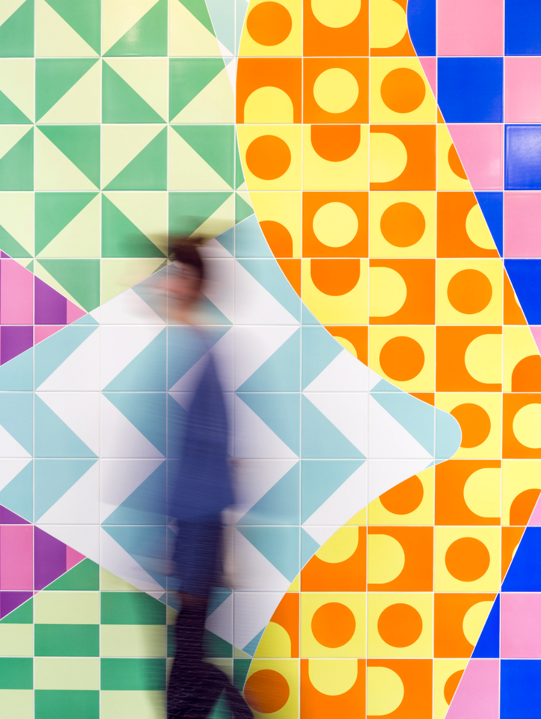
I think probably the series of artworks called Radiance that I did for Chelsea & Westminster Hospital Maternity Centre. I am just so honoured to be able to have created something that adds in some way to the experience of patients, visitors, and new-born babies (!!) at one of the most intense and important points in their lives.
You create such beautiful imaginative pieces in so many different mediums, do you have a favourite way of working?
I tend to work in a very traditional way, I draw, and write, and make little models, and then work things up in 3d on the computer, though I just love going through this process for projects in a range of different materials and at a range of different scales, from big public installations, to a spoon. I think this jumping around between really different kinds of projects is like creative brain aerobics, it keeps me excited and stops my brain getting lazy!
“I think this jumping around between really different kinds of projects is like creative brain aerobics, it keeps me excited and stops my brain getting lazy! ”
You did a collaborative project with another brand we love, Swarf. We absolutely love the Symbols collection. Can you tell us a bit more about it?
I put out a question on Instagram a year ago, asking if any young brands wanted to hook up and collaborate with me as a designer (the invite is still open!), and Swarf got in contact. I absolutely adored (and still do adore) their products, their ethos, their beautiful way of presenting their product, and we met up and started chatting about creating a line together. I really liked how they use simple primary shapes for their handles, and wanted to extend this language but in a new manner that was complementary to, but a bit different from their existing range. I am always, and have always been interested in how shapes can be as eloquent as language, and decided to take that quite literally in this instance, and created a series of geometric hieroglyphs, which are also handles, and which one can combine in different fun ways on different doors or drawers in one’s place. We were thinking of them actually as little emojis for your home! So it was a very fun, organic collaboration...
What has been your favourite project so far?
Probably The Roman Singularity, which was a sprawling, multi-media exploration of queerness and alterity in the city, and in architectural history. It was very exciting for it to be the lead feature on BBC Front Row, and getting interviewed by the amazing Mary Beard! (a dream come true…)
As a brand that truly believes in the power of colour, we have to talk about Nagatacho. It’s the interior dream. How did that project come about?
My mother is from Japan, and it came about through family acquaintances who really liked my portfolio, and wanted a space that was like my work. I was extremely happy to oblige, it was just such a complete joy to design!
Your New Town tile collection with Botteganove might be one of our favourites. Can you tell us a bit more about them.
Oh I LOVE that collection so much, it’s a bit of a dream come true for me. I just adore ceramics with a passion (I actually dealt in antique ceramics while I was at University, an activity that hugely influenced my design direction at the time), and getting to work with an Italian company that still handcrafts each and every tile individually was so thrilling. Also the director of the company shared so many of the references I love, both in terms of design but also theory (he has a copy of Richard Sennett’s “The Craftsman” above his desk at all times!) so that the design process was extremely collaborative, alot of backwards and forwards, which made it really fulfilling and fun. The collection is a mix of British classicism, Georgian town planning with its crescents and circuses and squares (hence the name New Town, like the area in Edinburgh), and the textured irregularity of Carlo Scarpa’s (a master designer and architect from the region Botteganove is based in) paving designs, especially of his Querini Stampalia. There is a lot of variety in the collection, in that on the one hand Botteganove makes any colour you want, but also that each tiles come in both a version with textured grooves that create a strong three-dimensional effect, and smooth, and one can mix the two together as you wish, but they also come in porcelain as floor tiles, so a lot of different effects can be created for different projects depending on what the architect or designer wants.
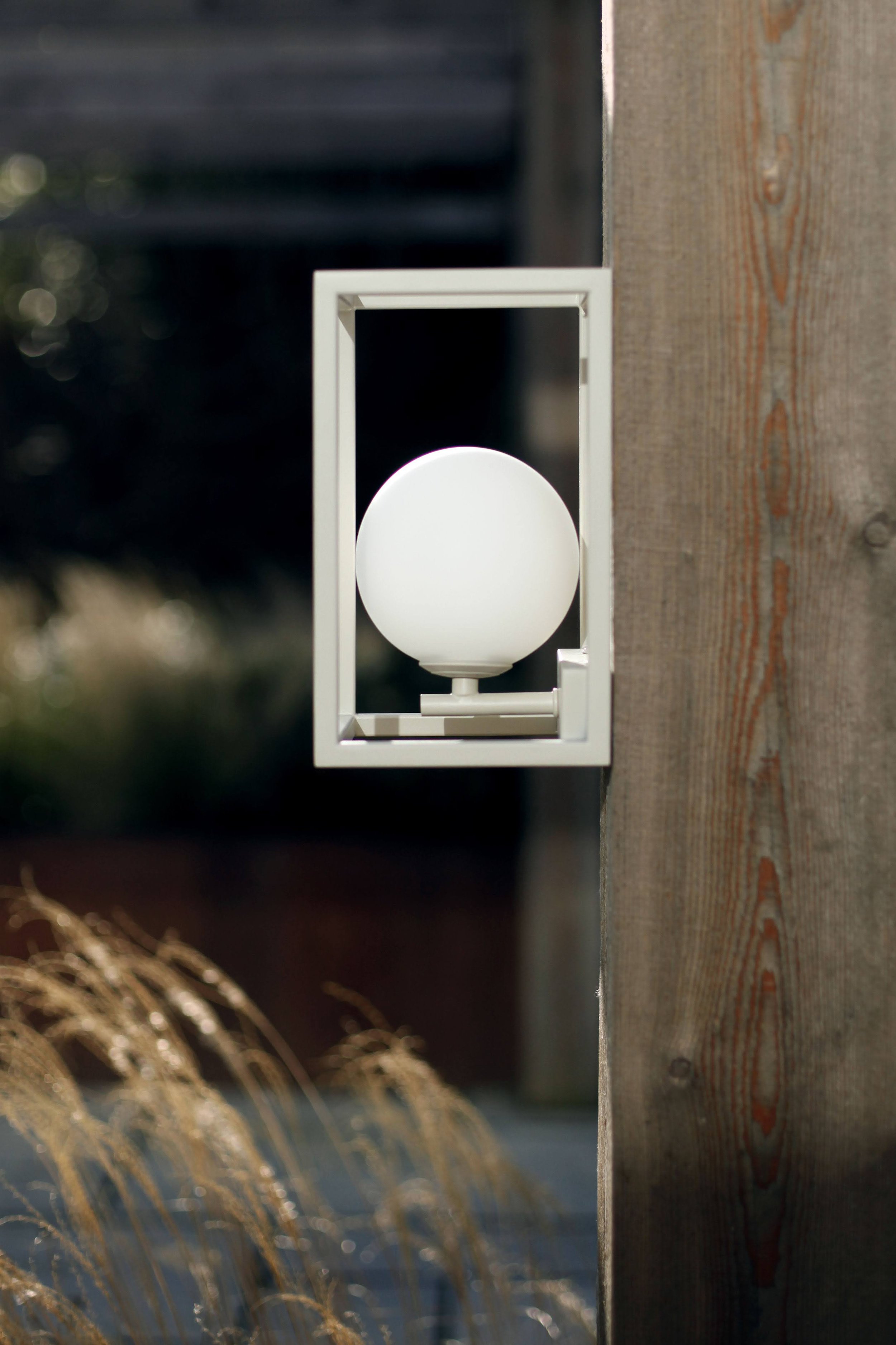
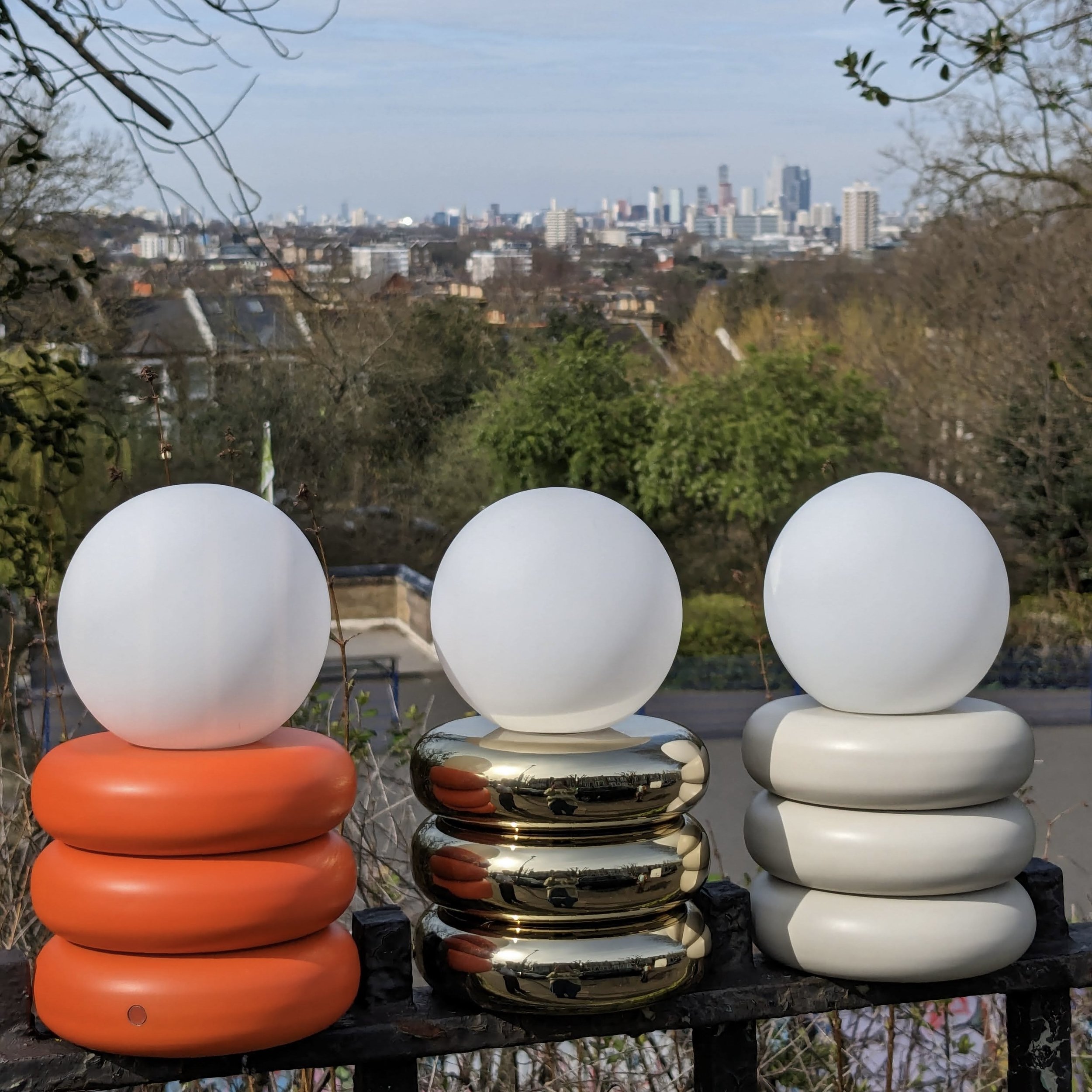
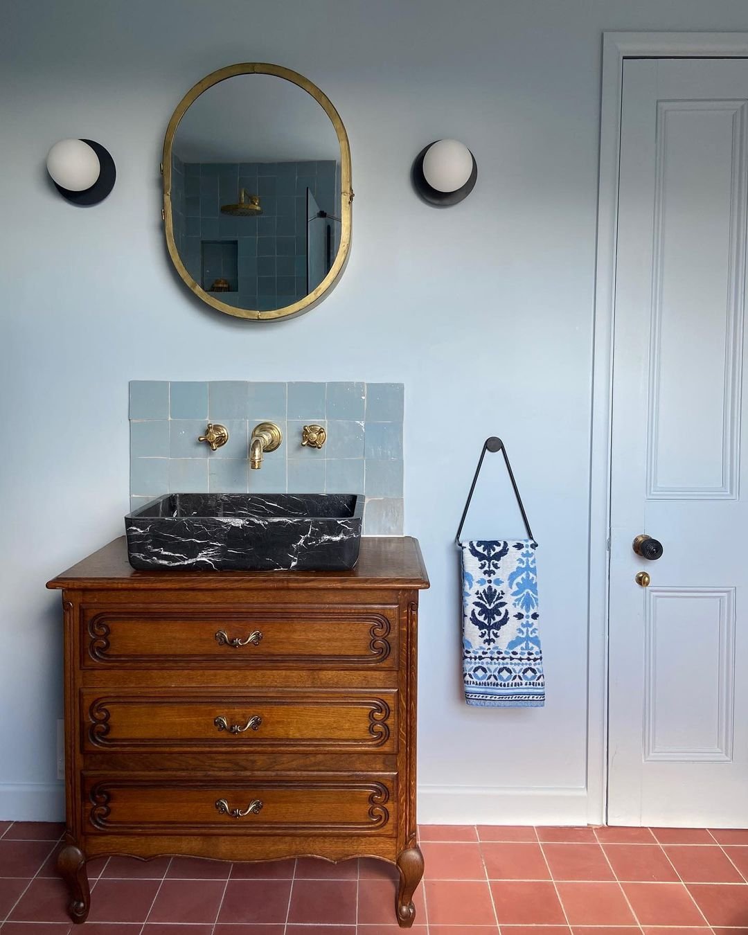
Finally, if you had to pick a light for your houseof wish list which would it be?
I’m going to say the wall diffuser in Blue! Although obviously, my favourite will be any lights we do together if we collaborate one day.
houseof says to keep your eyes peeled...


