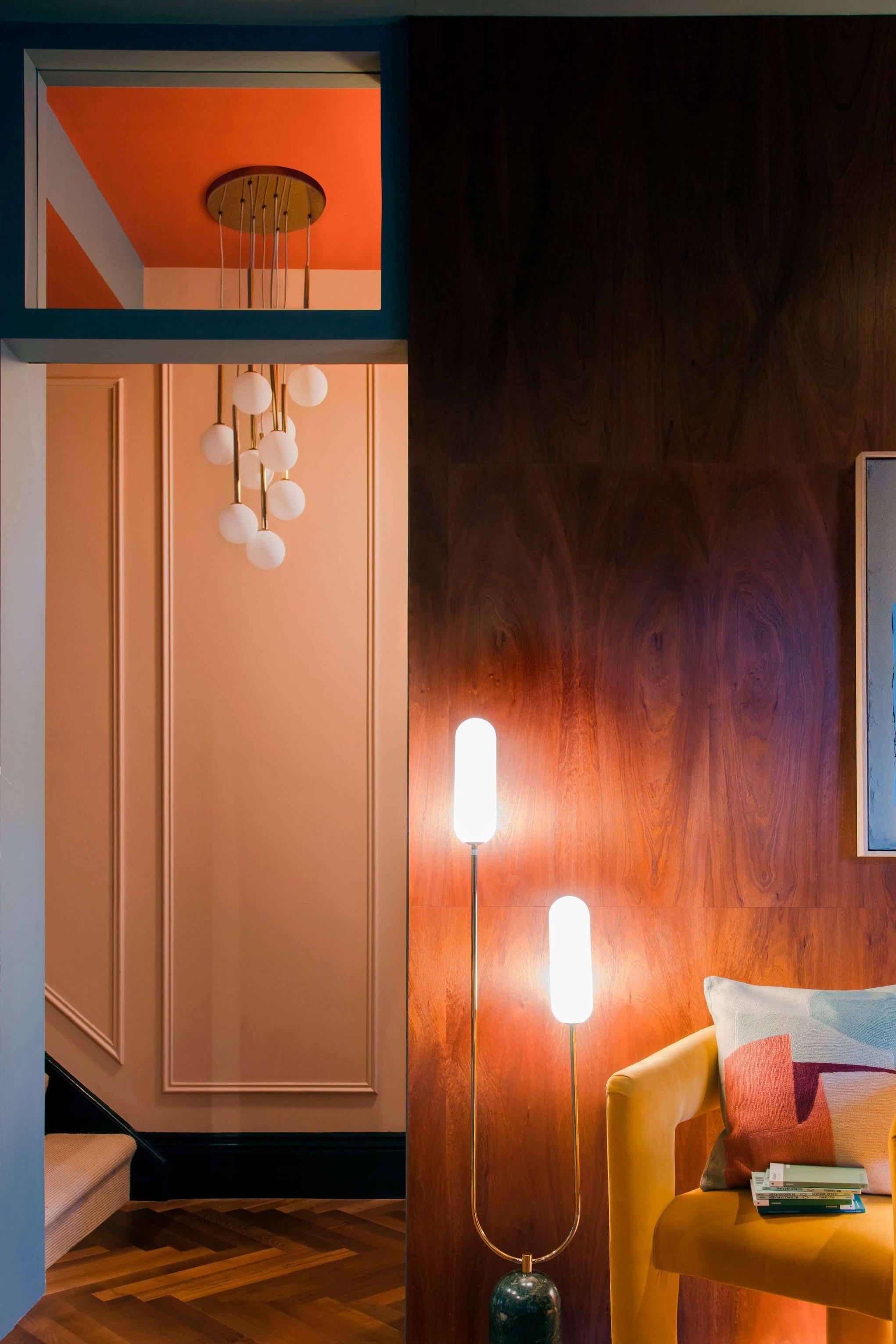
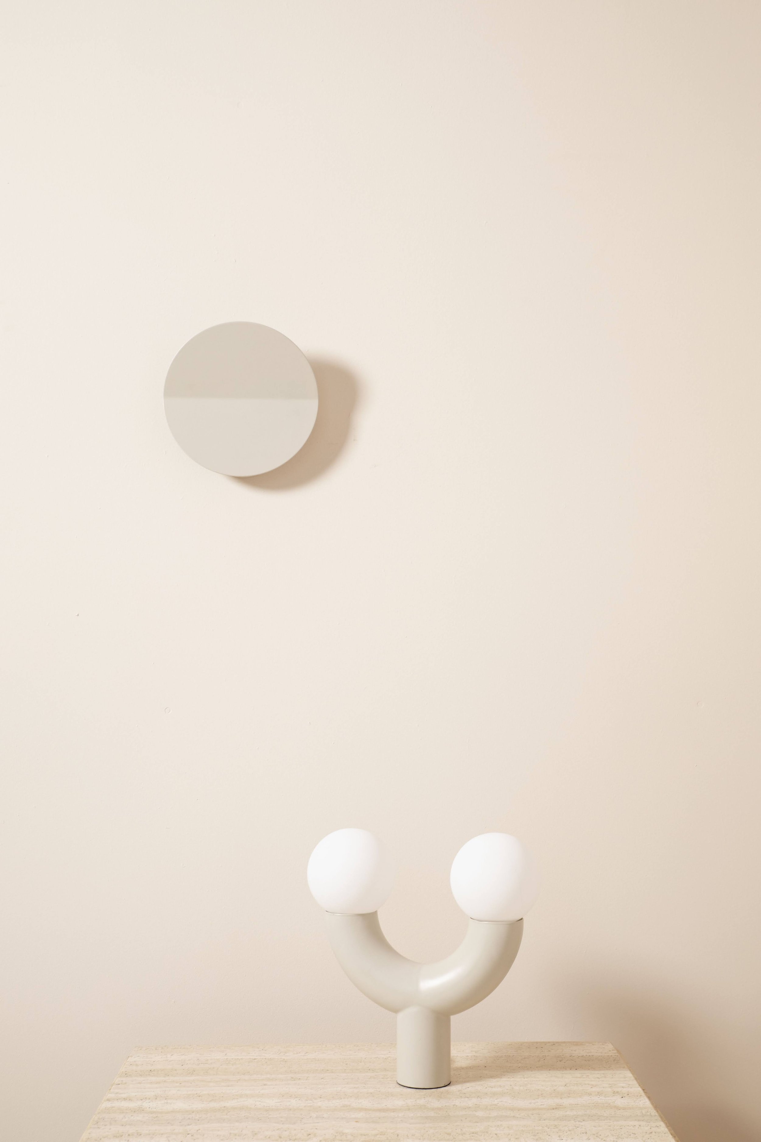
Product Focus - houseof you colours
Inspiration to help you design your own light within the houseof you collection.
We are spoiling you. There are 147 different combinations within our houseof you collection meaning that finding bespoke, tailor-made lighting just got easier.
With so many combinations we thought we would run you through our favourites and show you some inspiration to help you get creative.
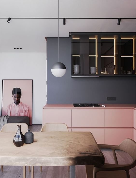
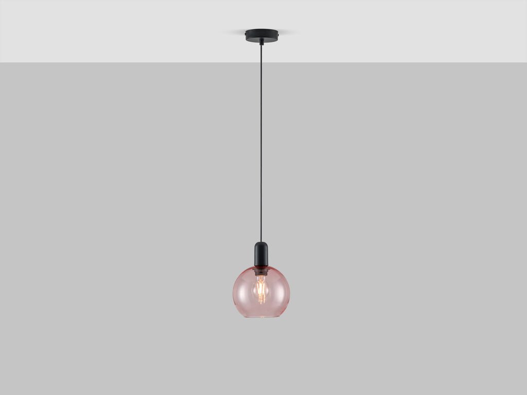
Pink and Charcoal
Using matt charcoal grey suddenly makes millennial blush pink feel grown-up and moody. We love this colour combination in the bedroom or kitchen.
Blue and White
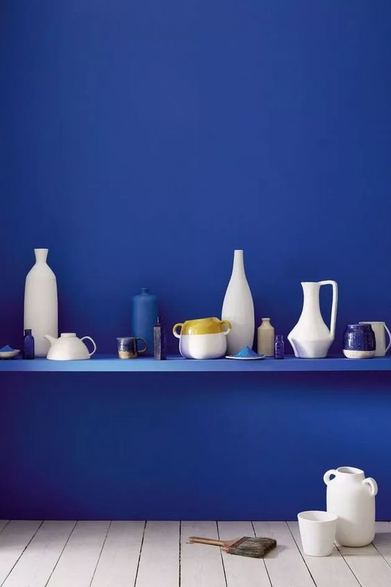
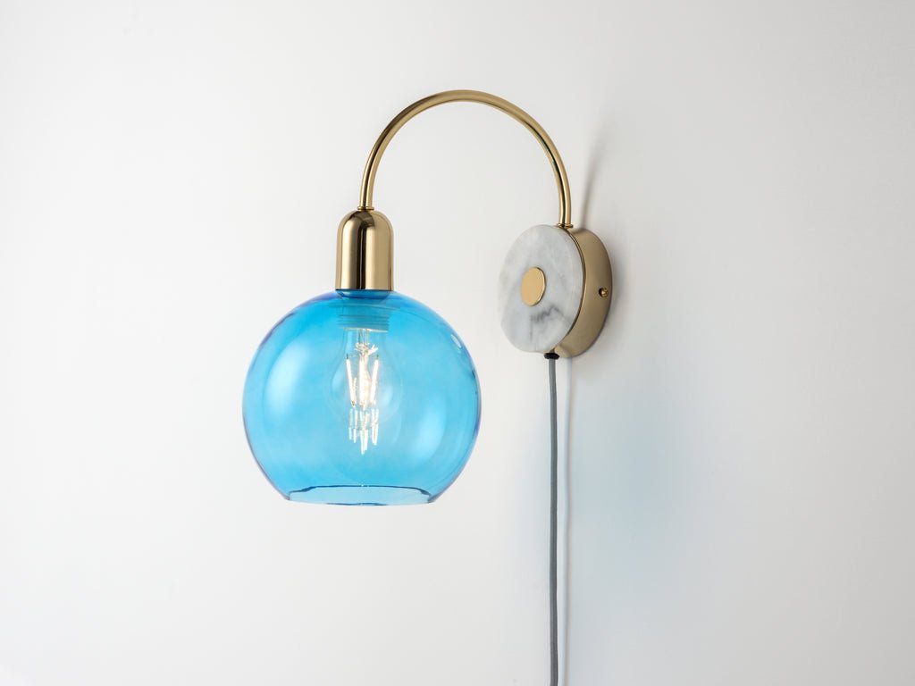
Blue has been used in our interiors for a couple of years now but our bright blue is used as an accent colour. We aren’t suggesting that you paint your whole room to match but instead use this as an accent on a blank wall or as a centrepiece in a room.
Olive
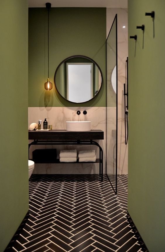
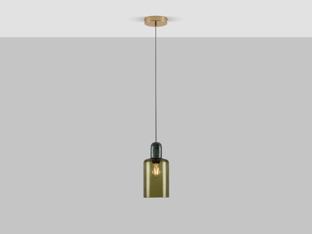
Green is back, but it isn’t teal this season the colour is now olive. Olive is rich and grassy and originates from the scandi interiors we have seen on the continent. Green also looks amazing with pink, so try hanging this green pendant against a pink wall like the bold confident interior designer you now are.
Charcoal
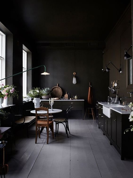
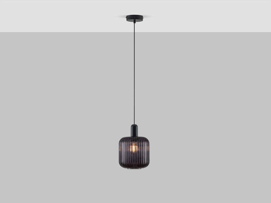
Nearly black, our charcoal colour is a staple this season. Create a dramatic lighting scheme for your house using texture rather than colour. Textured ribbed glass and matt fittings create a striking contrast against white walls.
Need more inspiration, check out our how to use guides for our houseof you wall light and ceiling light.
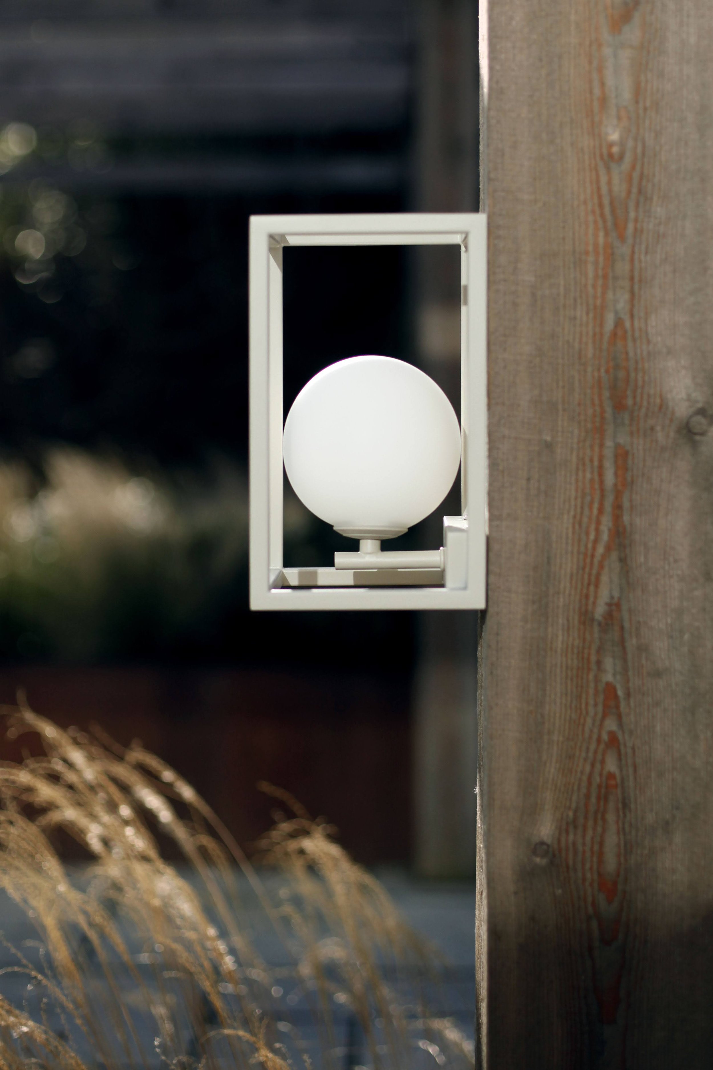
Selecting the right light fixtures can elevate a simple garden into a sublime sanctuary. This guide focuses on our sophisticated neutral colours—sand, charcoal grey, and white—that blend seamlessly with natural environments and architectural styles.
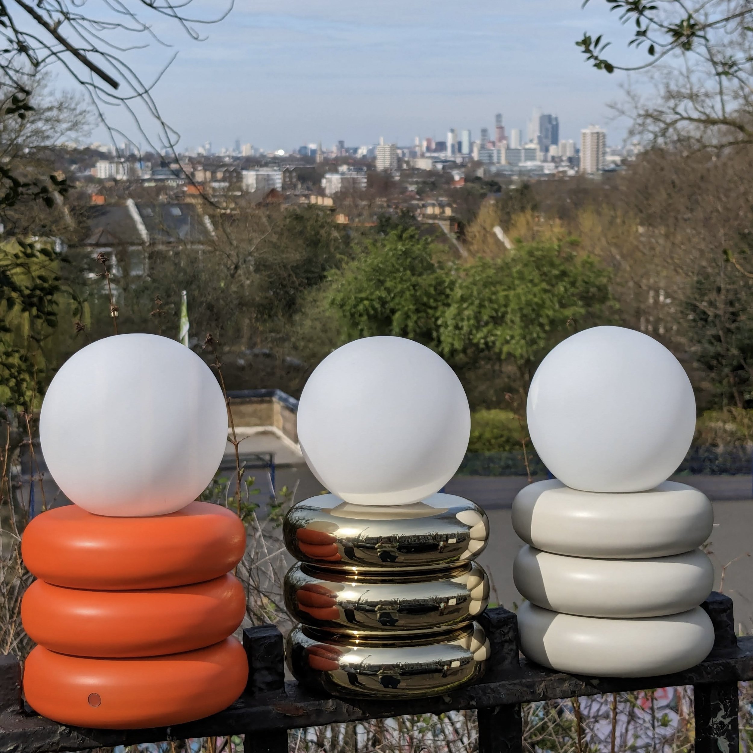
As the days stretch out and the air grows warmer, there’s a collective yearning to soak up every last drop of summer. This is where portable garden lighting truly shines, offering the perfect solution to extend those balmy evenings well into the night.
Bright, bold, and utterly a-PEEL-ing, 'Peel' is a hue that perfectly blends joy and positivity with warmth and creativity. This vibrant, refreshing, and dynamic colour brings a dose of hope and positivity, especially needed during uncertain times. Echoing the warmth of Pantone’s "peach fuzz" and the nourishment of WGSN’s "apricot crush," our 'Peel' orange radiates comfort and vitality.
The early 2000s were a defining era for interior design, characterised by a distinct embrace of chunky, inflated forms that brought a sense of fun and playfulness into the home. As we navigate through 2024, we're witnessing a dynamic resurgence of this noughties design trend, but with an even more adventurous spirit.
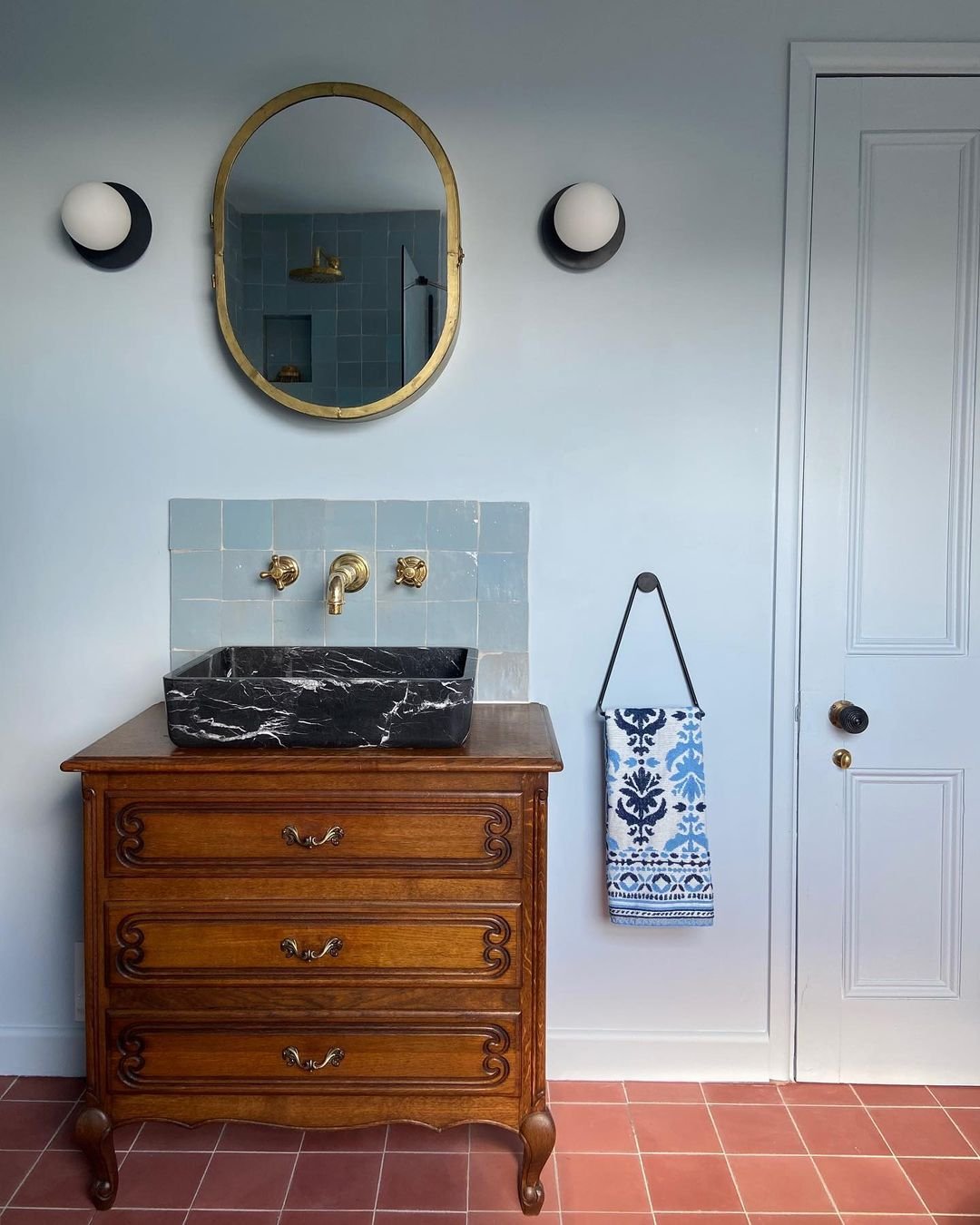
When it comes to designing a bathroom, lighting often takes a backseat. However, it's time to shine a spotlight on the unsung hero of our bathroom spaces. At houseof.com, we believe that bathroom lighting doesn't have to be mundane or purely functional. Through the strategic use of wall lights, ceiling flush lights, and ceiling pendant lights, we can transform any bathroom into a bright and stylish sanctuary.
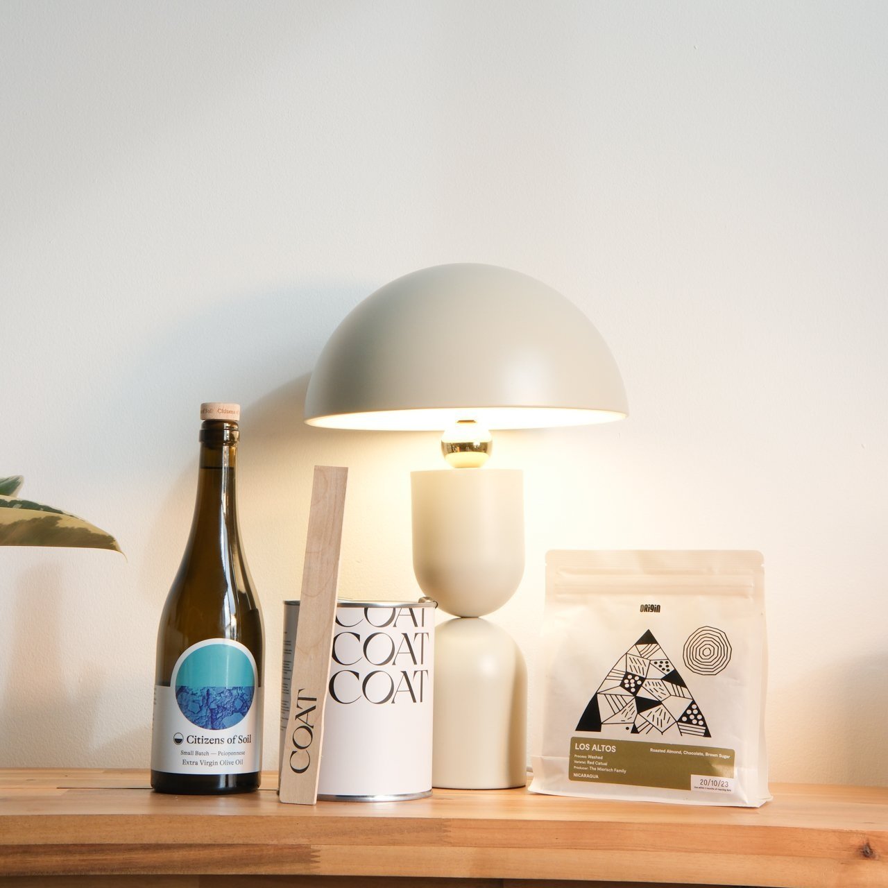
Celebrating B Corp month, we're delighted to spotlight our collaboration with pioneering B Corp brands that share our dedication to quality, sustainability, and ethical business practices. This month, we're joining forces with COAT Paints, Origin Coffee and Citizens of Soil.
As you step into a home, the hallway acts as a prologue to the story of its interiors. This space, though often traversed but seldom pondered upon, has the potential to set a compelling tone for the rest of the house.
The hallmark of slim wall lighting is its incredible efficiency of space. Designed to adhere closely to walls, these lights project their luminance without protruding into the living area. This feature is invaluable in areas where every inch matters, such as narrow hallways, small bedrooms, or compact living rooms.

